When I joined Ricoh Asia-Pacific at the Australia branch, the business was badly in need of brand revamp which finally happened with the migration and relaunch of Ricoh Australia on the Sitecore CMS. With the digital redesign underway, it was important to start a new company styleguide which could inform the business about the newly branded website and digital guidelines, while also allowing for rapid web page prototyping and designing for web experts.
Ricoh APAC Design System and UI kit
It was my responsiblity to create both an internal stylesheet for all Ricoh web stakeholders and to create a prototyping tool so that designers could build iteratively for the development teams. The system needed to be accurate enough that developers could build the same pages to spec, but they also needed to allow enough freedom to design for bespoke campaigns.
I used Sketch tool for this project for it's accessiblity and robust design features. I built in about 90% of our most commonly used web components on our new website while turning each component into a reusable symbol. This ensured that each time a new page needed to be designed, it would simply be a matter of dragging and dropping the symbols onto the new page.
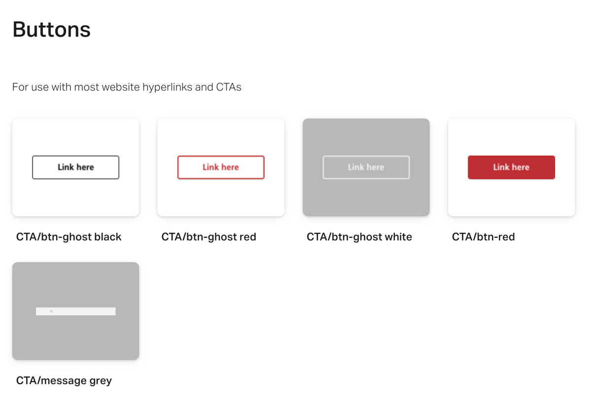
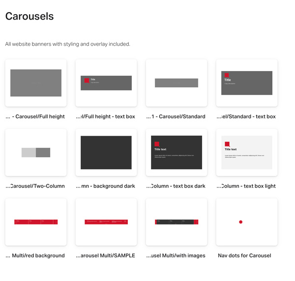
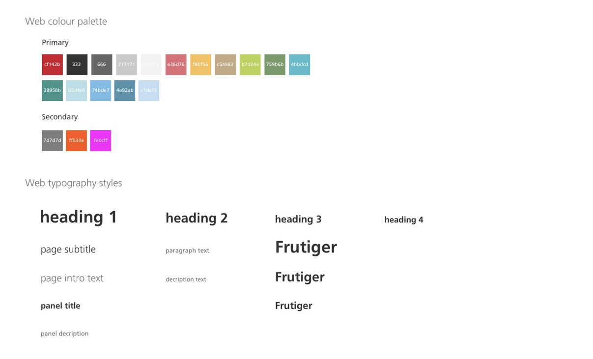
Building out the User Interface kit. It was important to get the styling of even small design items like typography or CTAs as accurate to the website as possible to ensure a smooth transition when the prototype was passed from the designers to the developers.
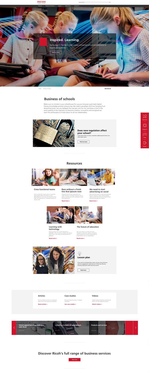
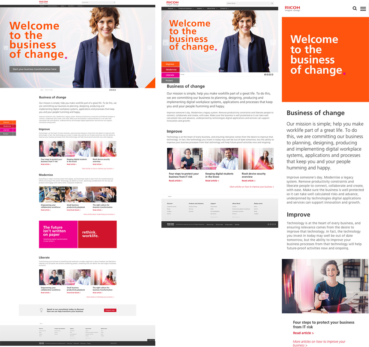
Once the first phase of the Design System was complete, our team was at a stage where we were starting to roll the website out regionally to countries across Asia-Pacific. We were finding that different OpCo's often required a unique set of layout of design which became more difficult to handle as a single design team taking care of many countries needs.
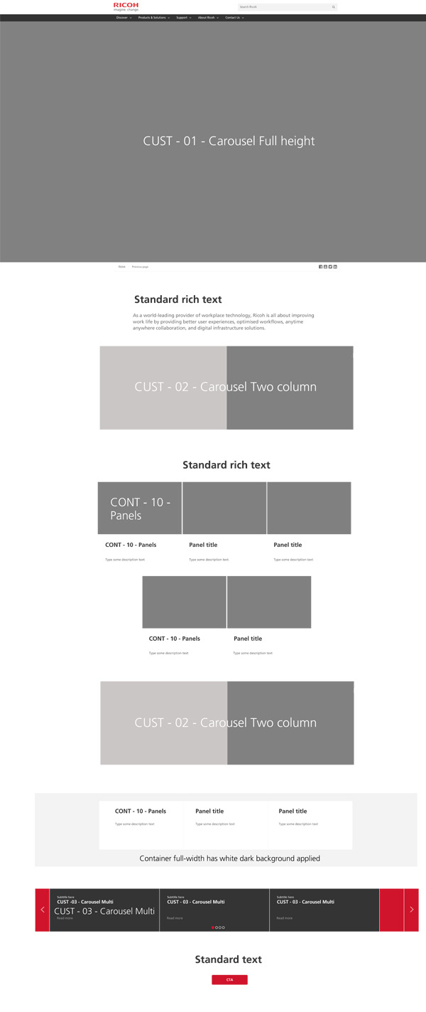
To counter our team's regional dilemma I created 4-5 new page templates for our website using the design system, including basic wireframe options for large campaign landing pages, small campaign pages, corporate pages and support sections. It was also important that each symbol be dynamic in that you could place different sizes of images or copy into each designated section to mirror what the final web page might look like once in the production environment.
We were still able to modify each template for individual campaigns, but this would greatly improve and speed up our workflow while also giving the regional sites a sense of brand uniformity while still allowing for individuality as required.
After stakeholder approvals, I was able to provide the new templates to our developers to have them built into our CMS as a new important feature fo regional rollout.
Now that we had a robust Design System and UI kit for our internal designers and external vendors to use, it was then important for us to create and update an internal style sheet not just for designers, but for all stakeholders to view and appraise which could be a reference to help them plan web content, design for print materials, social media, video or any other marketing materials.
To accomplish this, we were able to connect our new Design System to Invision. This allowed to upload all of our new symbols / components to the app and build a styleguide website which not only included web component styling and specifications, but also guidelines for SEO, copy writing for web, information about how to use the Ricoh brand colours, logo and typography.
Invision also allowed us to share designs online not only with each other, but also stakeholders and managers who were keen to see their campaigns in progress before being passed to the developers. This process improved our business' digital workflow, allowing stakeholders to easily make changes, comment or approve on designs at iterative stages of development, and we were also able to add interaction and animation elements to the prototypes to mirror the real websites.
The Ricoh APAC Design System & UI kit provided a number of value offerings to the business -
- Rapid yet accurate low fidelity wire framing for concept briefs
- Detailed high fidelity prototyping with interactive elements for easy translation to development
- Prototying and creation of more web templates to benefit the needs of regional websites
- An online styleguide which can be acccessed by all company staff to be used as a digital brand management tool
- Greatly enhancing up our department's workflow which enables us to service 10 different OpCo websites throughout the region.
For further information about this project, or to see view the tools in operation please contact me.